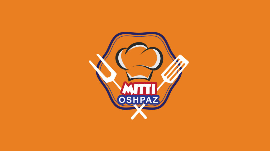
Mitti Oshpaz — Food & Catering Brand Logo Design
Iyun 5, 2026
Mitti Oshpaz — Food & Catering Brand Logo Design
A bold, energetic, and appetite-driven logo design created for Mitti Oshpaz, a food and catering brand that brings the passion and confidence of professional cooking to every plate it serves. From the very first glance, this identity communicates one thing clearly — this is a brand that takes its craft seriously and delivers it with flavour and flair.
At the center of the design stands a classic chef’s hat, rendered with dynamic shading and a sense of movement that gives it life and personality. Flanking it on either side are a meat fork and a spatula, crossed in an X formation — a composition that instantly evokes the world of professional kitchens, open flames, and masterfully prepared food. The hexagonal badge frame that contains the entire mark gives the logo structure and authority, lending it the kind of visual weight that works powerfully on signage, packaging, uniforms, and digital platforms alike.
The brand name is split across two bold label shapes — «MITTI» in red with white lettering, and «OSHPAZ» in deep navy blue — creating a strong color contrast that ensures maximum readability and visual impact at any size. The typography is chunky, confident, and full of character, perfectly matching the energy of a brand that is unapologetically proud of what it cooks.
The vibrant orange background ties everything together — warm, stimulating, and unmistakably connected to the world of food. Orange is one of the most appetite-inducing colors in visual design, and here it amplifies the brand’s energy, making the logo feel alive, inviting, and impossible to ignore.
Mitti Oshpaz now has a visual identity as bold and satisfying as the food it represents — a mark that commands attention, builds recognition, and tells its story before a single word is spoken.